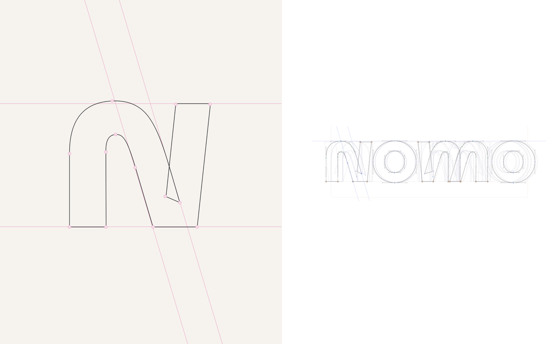
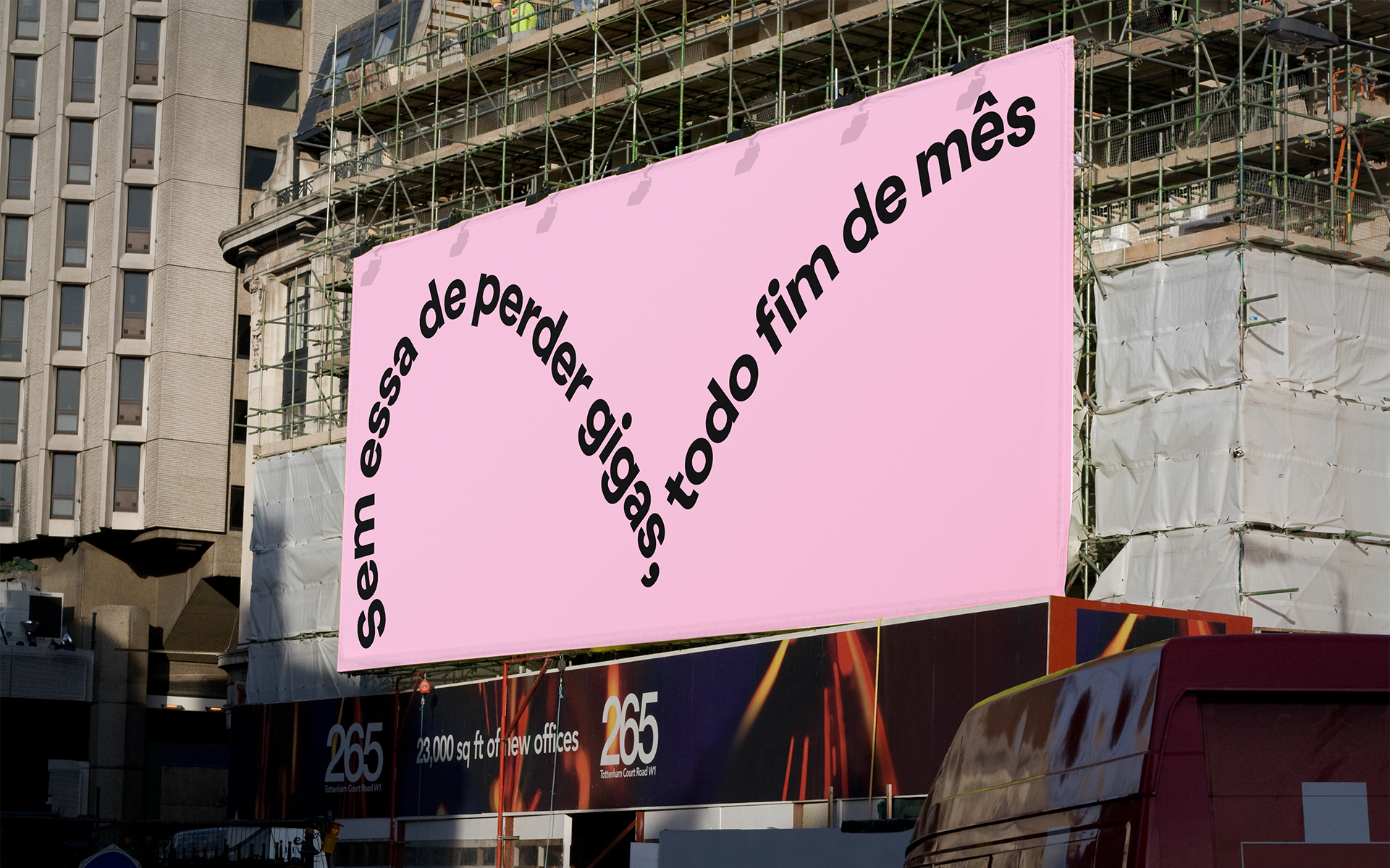
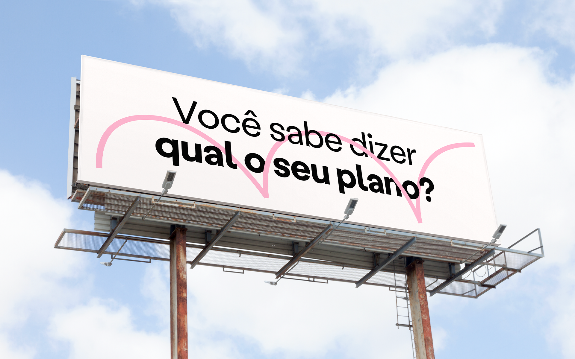
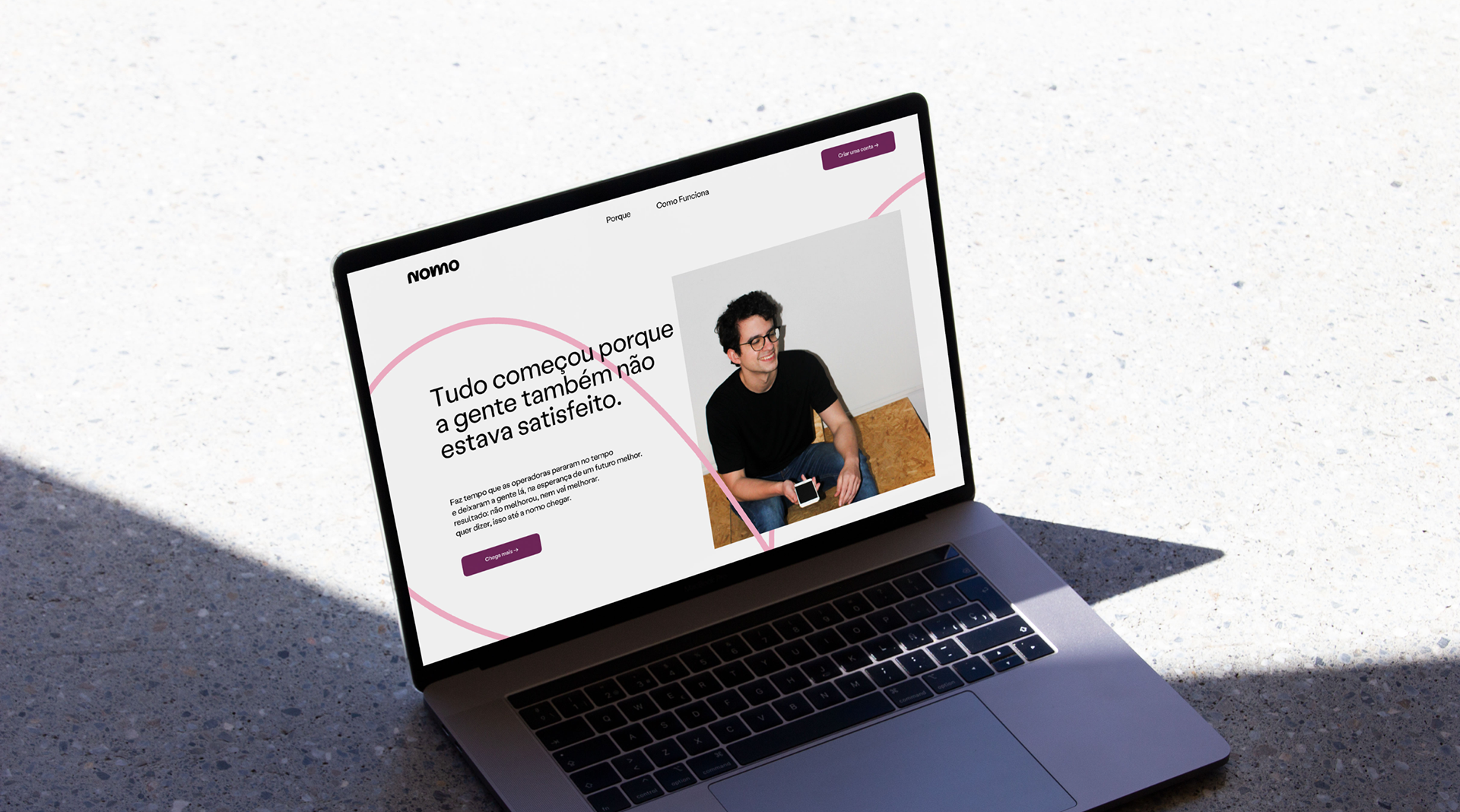
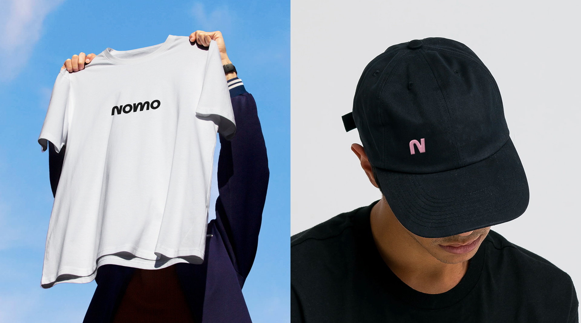
Change is about constant movement.
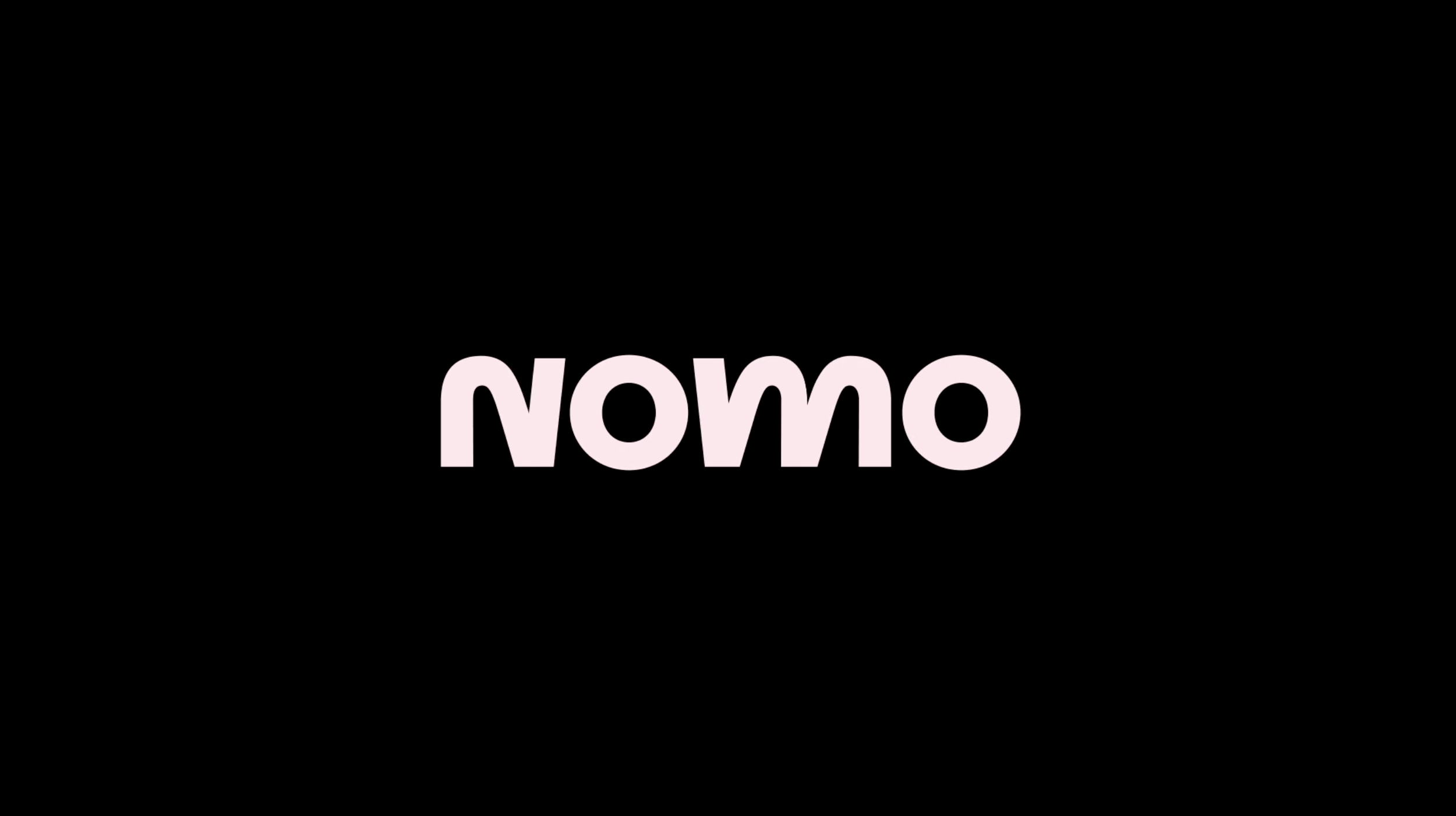
Nomo is a telecom startup that it was born to the way things are done in the telecommunications segment. From the desire comes the name NOMO - no more. The brand's proposal is not only to do things differently, but better. This implies the need to say generate opposition, proposing ew paths. In the telecom segment, the vices of visual language revolve around “neon lights” that mention speed (fiber optics) and three-dimensional effects in communication. The natural approach for Nomo is to propose something different from that. Every visual translation took place based on a simple proposition: in order to change, there must be the inevitable movement of opposition. Without destroying what already exists, but learning from what doesn't work to do better.
Client
Nomo @BR/Bauen
Role(s)
Design development